Making Complex Systems Feel Simple
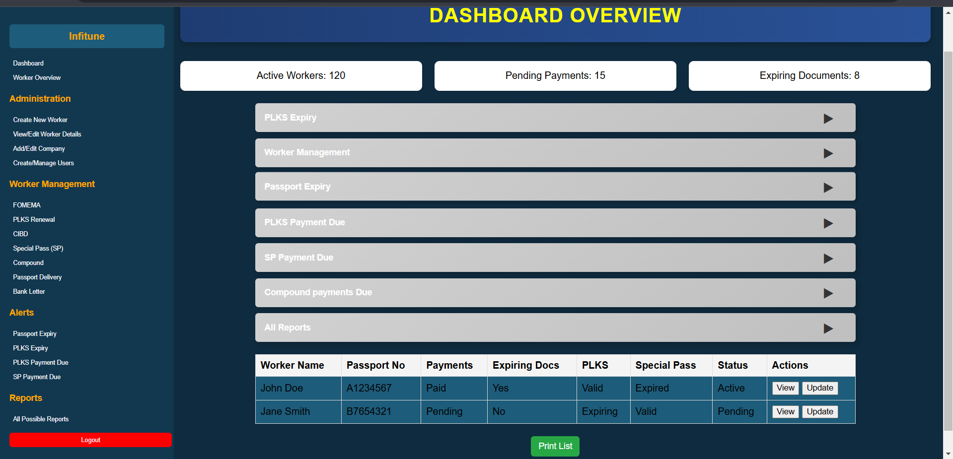
Visa processing involves dozens of data fields, multiple approval stages, document uploads, status tracking, and cross-department communication — all in one system. The existing interface had grown organically over years and was slowing staff down with cluttered layouts, inconsistent patterns, and no clear information hierarchy.
The brief: redesign the interface from the ground up using proper UX methodology — research, wireframes, testing, iteration — and deliver a system that staff could use faster with fewer errors. The result was a 30% improvement in data processing efficiency measured against baseline task completion times.
The Interface
Research to Delivery
User Interviews & Task Analysis
Interviewed 8 staff members across processing, review, and approval roles. Mapped current task flows and identified the top friction points: too many clicks to reach key data, no status at a glance, inconsistent form patterns.
Information Architecture Redesign
Restructured the navigation and data hierarchy based on actual task frequency. Most-used actions moved to primary positions. Grouped related data fields into logical sections with clear visual separation.
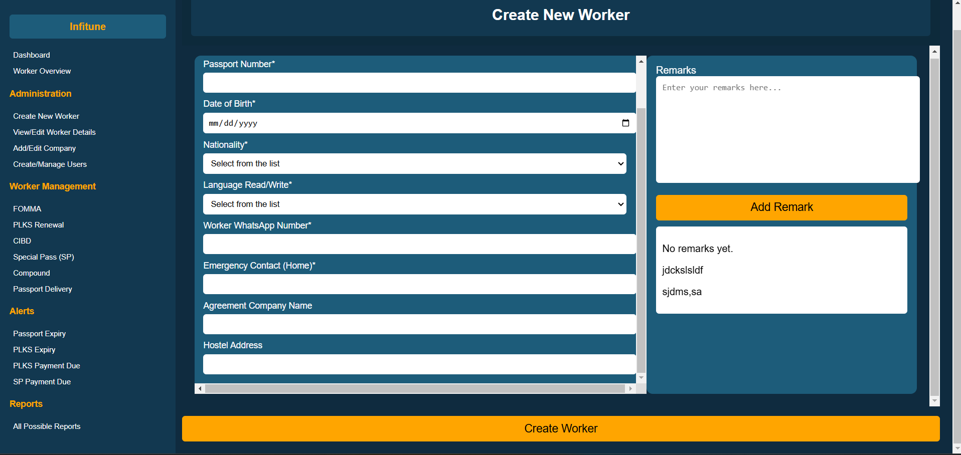
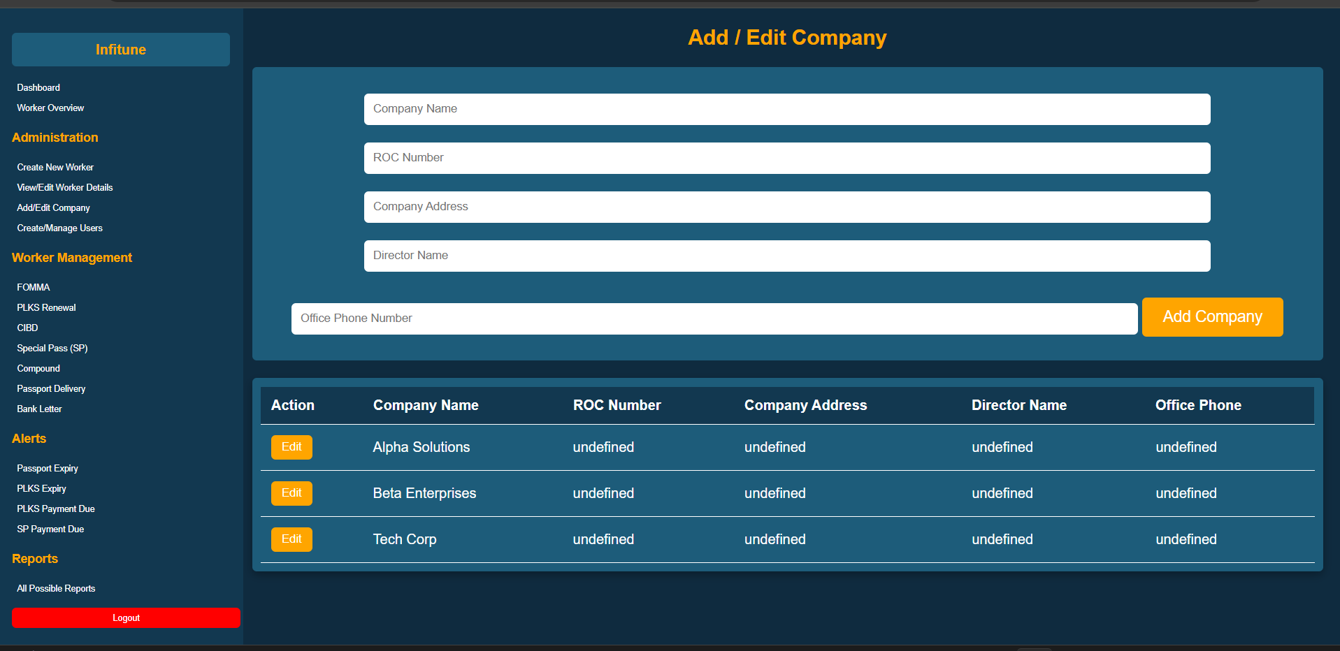
Figma Component System
Built a full component library in Figma — form elements, status badges, data tables, modals, and navigation patterns. Consistent components meant staff could predict where to find things across every screen.
Usability Testing & Iteration
Ran task-based usability tests with 5 staff members using Figma prototypes. Measured task completion time and error rate against the old system. Two rounds of iteration before final handoff.
Tools & Technologies
Complex System? I'll Make It Usable.
I design enterprise interfaces that reduce friction, cut errors, and make staff measurably faster.